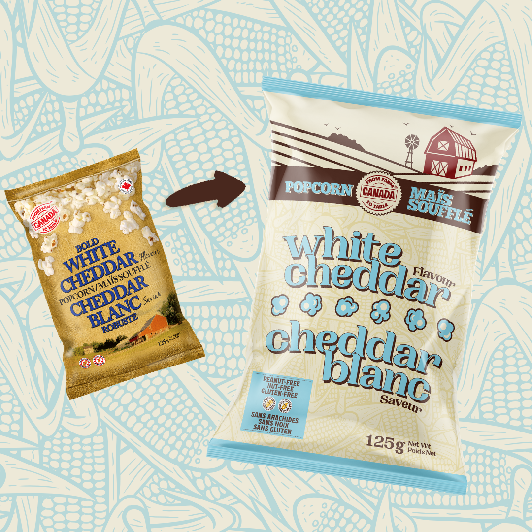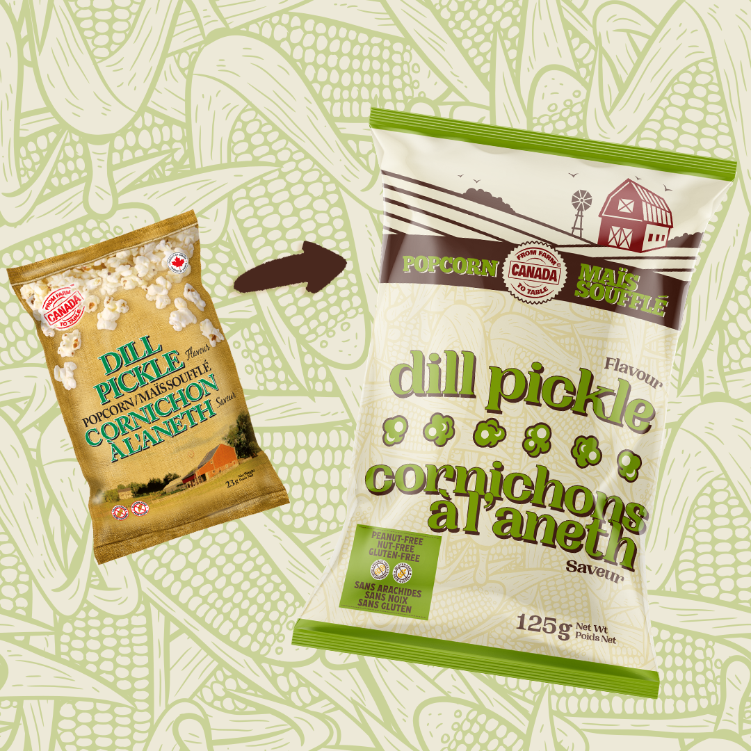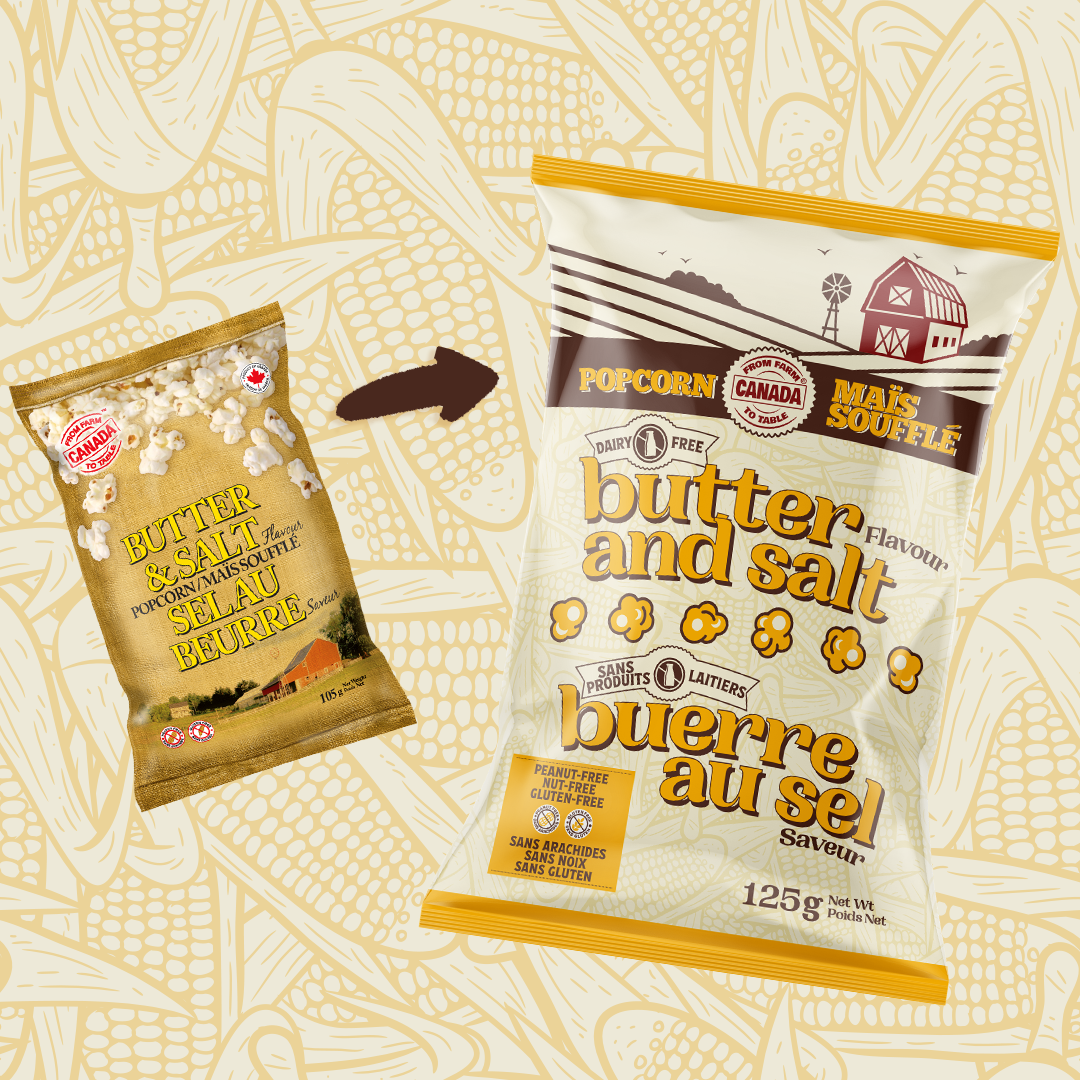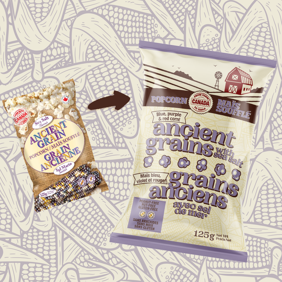
The owner of Farm to Table Canada knew that the unique value proposition of her product wasn’t clearly spelled out enough on her packaging. In adddition, she was paying for costly plates with the amount of colours she was managing on her packaging.
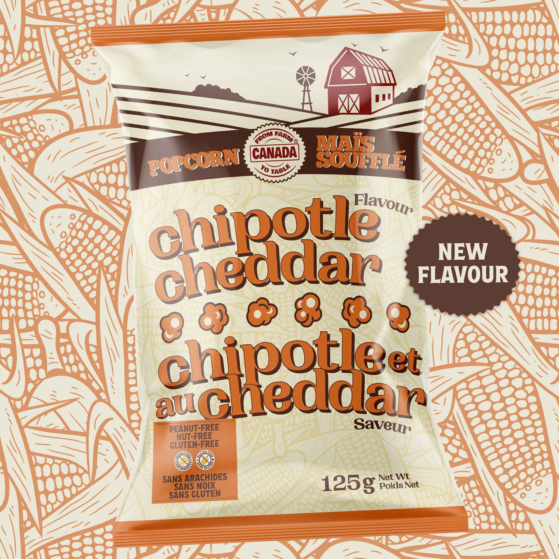
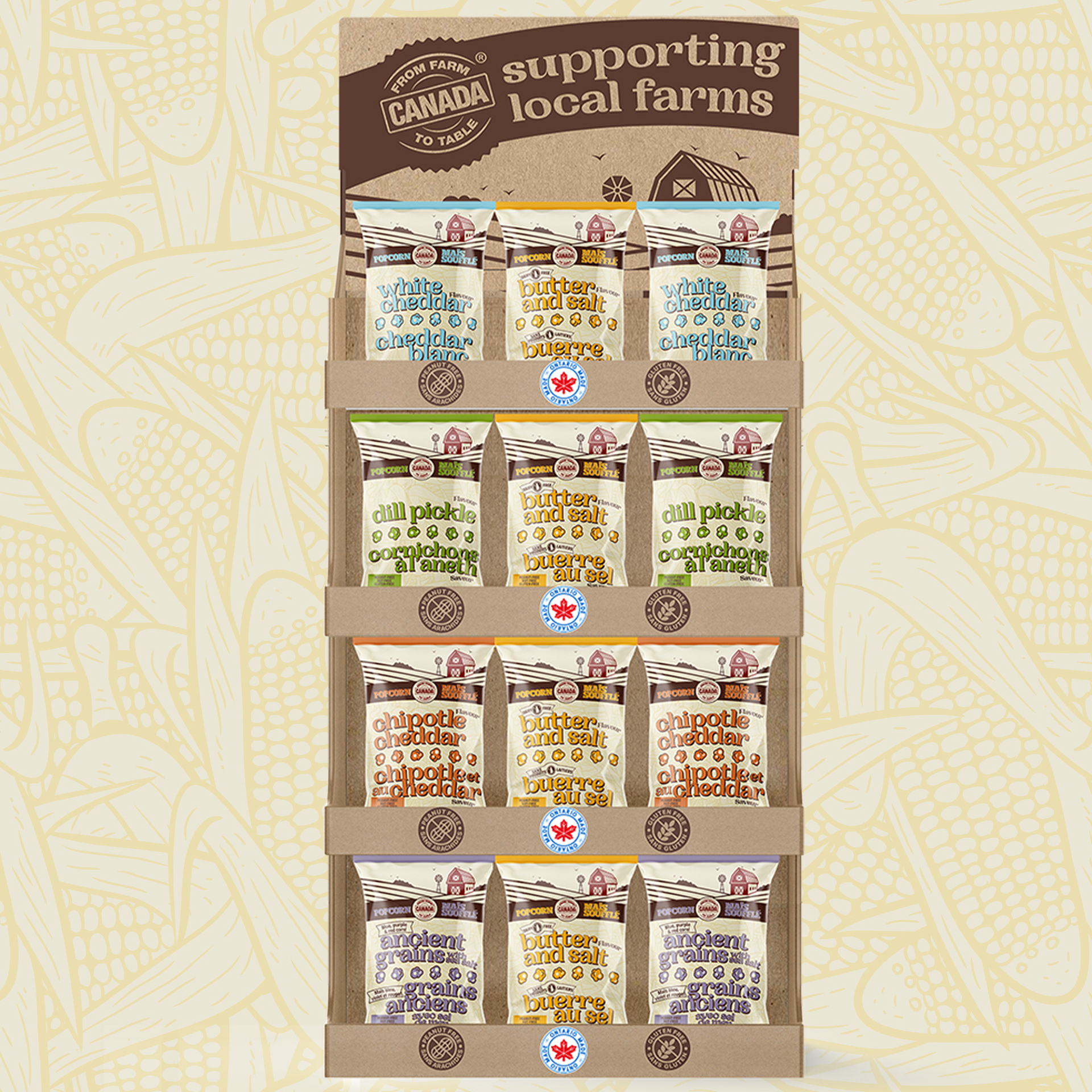
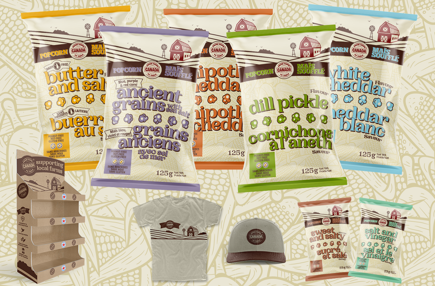
We streamlined the colour palette, converted the photo of the farm into an illustration, and brought it front and centre to the packaging. The typefaces were chosen intentionally to create an authentic Ontario farm feel.
Even from a distance, you can immediate get the feel of this company and their mission to stay local.