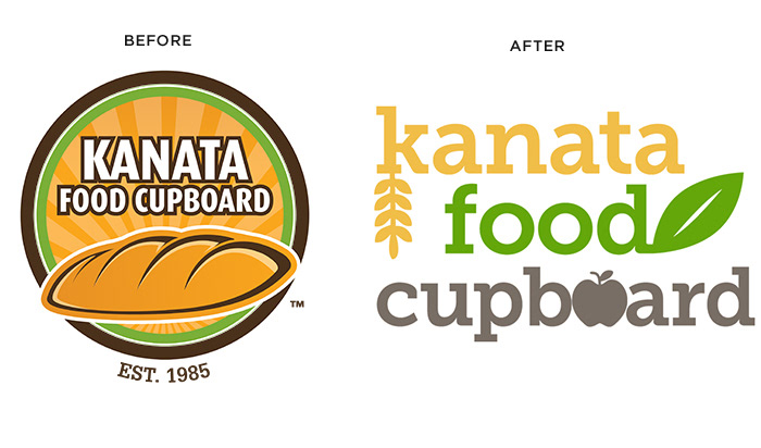
The Kanata Food Cupboard has an outdated brand and visual identity. The challenge however was that many of the long-standing volunteers were attached to the existing brand and unwilling to entertain the idea of a refresh. Careful consideration was made during the design process of their misgivings toward the project.
Early on in the process I made a decision to retain the existing colours of the logo as they were still fresh and contemporary. A food cupboard naturally has the theme of "food" at its core but I wanted to go beyond the normal conception of canned/prepackaged foods and decided to represent food in a more natural, healthy way.
Scanning the landscape of existing food bank brands, I found they were too modern and inaccessible looking, or very amateur looking. This was a great design to provide a warm, approachable visual identity that still retained an air of professionalism.
With collaboration from the marketing agency director who employed me for this project, we explored several ideas such as an open door or a simply typographic treatment. In the end we felt representing food was important and ultimately went in that direction.
The design was presented to the director and volunteer group and met with immediate and grateful approval. The group were quick to say that they were very happy that the new design both looked fresh and memorable and yet still respected the origins and culture of the organization.
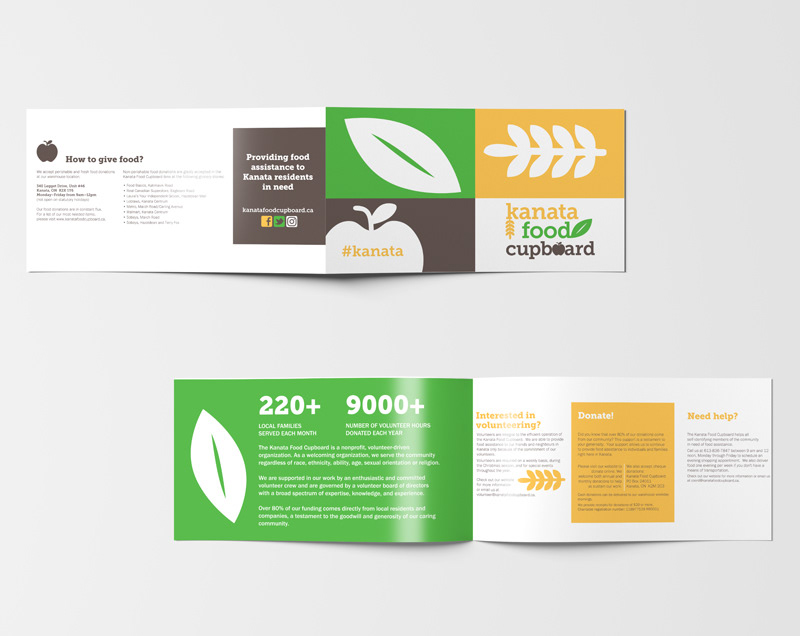
The new brand came with a manual for appropriate use, suitable typography and complementary colour palettes. Initially however any new materials that were required to be produced were created by myself.
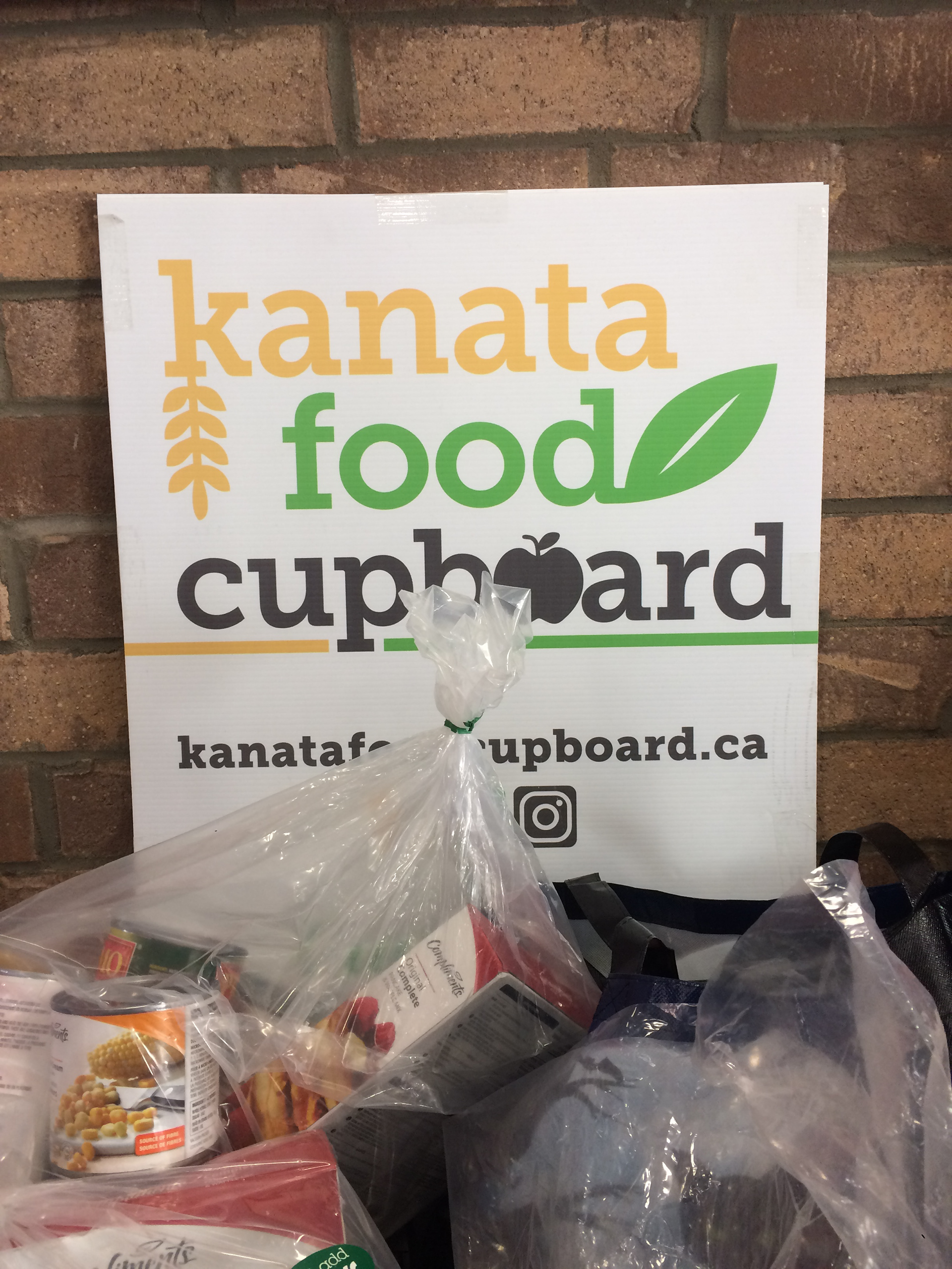
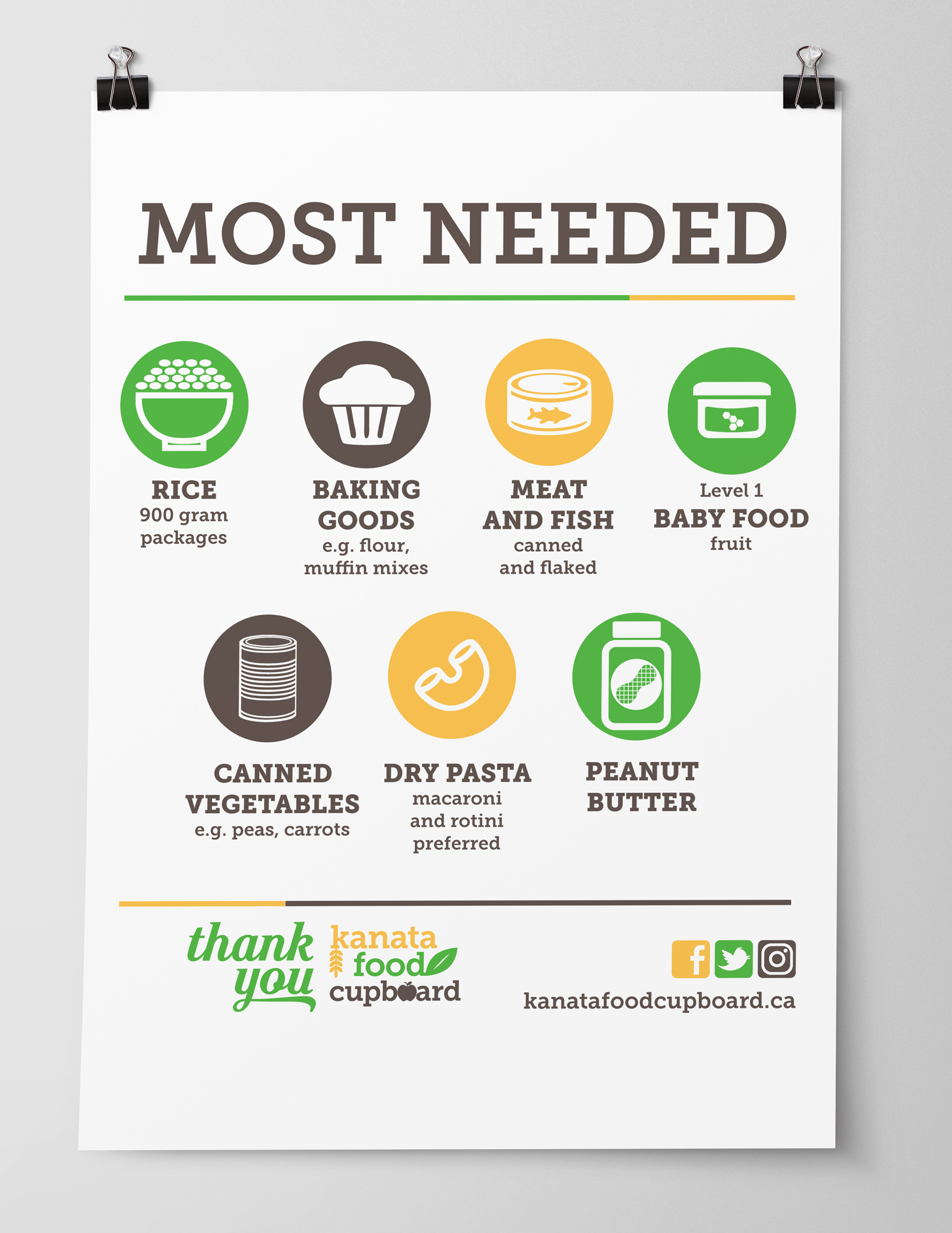
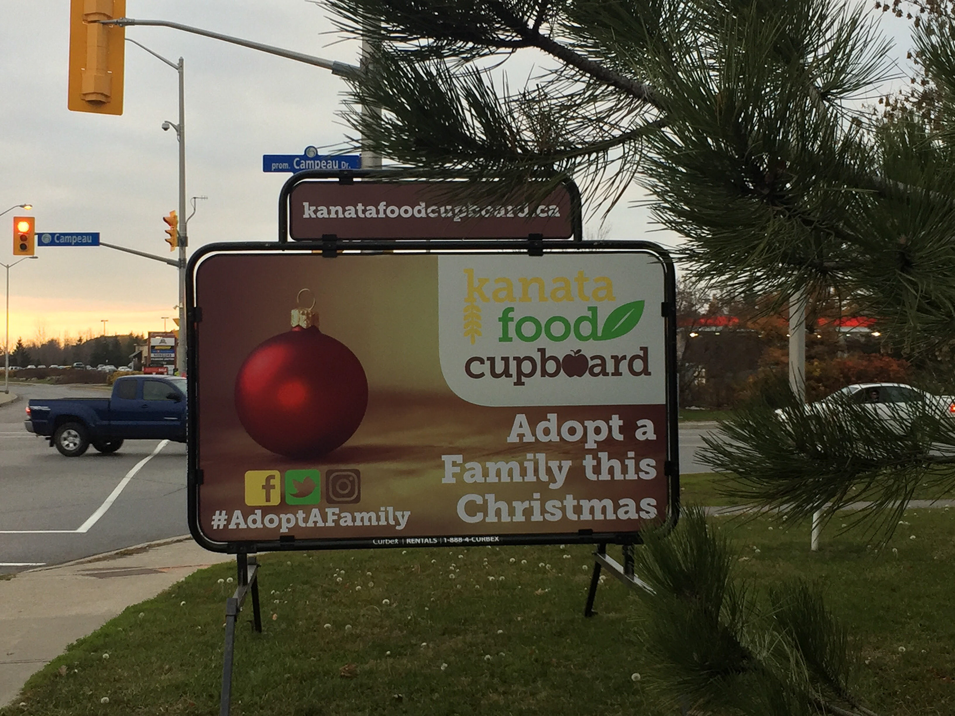
With pride in the new design, the visual identity was immediately put to use in billboards, signage, brochures, business cards, and a new website. The identity is still in use today and can be seen at food drop-off locations in grocery stores throughout Kanata.